
Last time I outlined a Wizard component I created, for Blazor projects. This time I’ll explain how I created the component.
The source for the project is available, for free, HERE.
The NUGET package is available, for free, HERE.
A working quick start sample is available HERE.
The component relies on the MudBlazor library. Because of that, we’ll see quite a few MudBlazor types as I walk through the code. If you want to know more about MudBlazor, HERE is a good place to start.
I named my wizard component MuddyWizard, as much to be funny as to denote it’s dependence on MudBlazor. Here is the markup for the main component:
@namespace CG.Blazor.Wizard
@inherits MudComponentBase

<CascadingValue Value="this" IsFixed="true">
    <MudCard @attributes="UserAttributes"
             Class="@Classname"
             Style="@Style"
             Elevation="@Elevation"
             Outlined="@Outlined"
             Square="@Square">
        @if (null != SelectedIndex)
        {
            <MudCardHeader Style="border-bottom: 1px solid grey;">
                @if (ShowChips)
                {
                    <MudGrid Justify="Justify.SpaceEvenly">
                        @foreach (var panel in _panels)
                        {
                            <MudItem>
                                @if (panel == SelectedPanel)
                                {
                                    <MudChip Size="Size.Small"
                                            Color="@HeaderChipSelectedColor"
                                            Variant="@HeaderChipVariant"
                                            Text="@panel.Title"/> }
                                else
                                {
                                    <MudChip Size="Size.Small"
                                            Text="@panel.Title"
                                            Variant="@HeaderChipVariant"
                                            Color="@HeaderChipColor"
                                            OnClick="(() => Select(panel))" />
                                }
                            </MudItem>
                        }
                    </MudGrid>
                }
                @if (null != SelectedPanel)
                {
                    if (!ShowChips)
                    {
                        <MudText Class="mt-2 mx-2"
                                 Typo="@TitleTypo"
                                 Color="@TitleColor">
                            @SelectedPanel?.Title
                        </MudText>
                    }
                    <MudText Class="mt-2 mx-2"
                             Typo="@DescriptionTypo"
                             Color="@DescriptionColor">
                        @SelectedPanel?.Description
                    </MudText>
                }
            </MudCardHeader>
        }

        <MudCardContent>
            @ChildContent
        </MudCardContent>

        @if (null != SelectedIndex)
        {
            <MudCardActions Style="border-top: 1px solid grey;">
                <MudTooltip Text="Move to the previous step.">
                    <MudButton OnClick="OnPrevious"
                            Disabled="@IsPreviousDisabled"
                            Color="@PreviousColor"
                            Variant="@ButtonVariant">
                        Previous
                    </MudButton>
			    </MudTooltip>

                <span style="display: flex; margin-left: auto">
                    @if (ShowCancel)
                    {
                        <MudTooltip Text="Cancel the wizard.">
                            <MudButton OnClick="OnCancel"
                                    Class="mr-4"
                                    Color="@CancelColor"
                                    Variant="@ButtonVariant">
                                Cancel
                            </MudButton>
				        </MudTooltip>
                    }
                    @if (@IsFinishVisible)
                    {
                        <MudTooltip Text="Finish the wizard.">
                            <MudButton OnClick="OnFinish"
                                       Color="@FinishColor"
                                       Variant="@ButtonVariant">
                                Finish
                            </MudButton>
					    </MudTooltip>
                    }
                    else
                    {
                        <MudTooltip Text="Move to the next step.">
                            <MudButton OnClick="OnNext"
                                       Disabled="@IsNextDisabled"
                                       Color="@NextColor"
                                       Variant="@ButtonVariant">
                                Next
                            </MudButton>
					    </MudTooltip>
                    }
                </span>
            </MudCardActions>
        }
    </MudCard>
</CascadingValue>
The MuddyWizard component contains a MudCard control. I did that because MudCard has the ability to break it’s content up into a header, a main body, and an action area. That three part layout is perfect for any wizard.
The MuddyWizard exposes these events:
- IndexChanged – raised whenever the user clicks the Previous or Next buttons. The event passes an IndexChangedEventArgs class, which has a property that can be used to override the navigation, for the wizard. This comes in handy if you need to dynamically skip a panel, at runtime.
- WizardFinish – raised whenever the user clicks the Finish button.
- WizardCancel – raised whenever the user clicks the Cancel button.
The MuddyWizard exposes the following properties, from MudBlazor, that are then bound to the inner MudCard instance:
- UserAttributes – Attributes you add to the component that don’t match any of the parameters.
- Class – User class names, separated by space.
- Style – User styles, appllied on top of the component’s own classes and styles.
- Elevation – The higher the number, the heavier the drop shadow.
- Square – If true, border radius is set to 0
There are a number of additional properties, that are specific to MuddyWizard itself:
- ButtonVariant – The variant for the wizard buttons.
- CancelColor – The color for the cancel button.
- DescriptionColor – The color for the wizard description.
- DescriptionTypo – The typography for the wizard description.
- FinishColor – The color for the finish button.
- HeaderChipColor – The color for the header chips.
- HeaderChipSelectedColor – The color for the selected header chip.
- HeaderChipVariant – The variant for the header chips.
- IsPreviousDisabled – True if the previous button should be disabled.
- IsNextDisabled – True if the next button should be disabled.
- IsFinishVisible – True if the finish button should be visible.
- NextColor – The color for the next button.
- PreviousColor – The color for the previous button.
- Panels – The panel collection.
- SelectedIndex – The selected index.
- SelectedPanel – The selected panel.
- ShowCancel – True if the cancel button should be visible.
- ShowChips – True to show chips in the wizard header.
- ShowFinish – True to show the finish button.
- TitleColor – The color for the wizard title.
- TitleTypo – The typography for the wizard title.
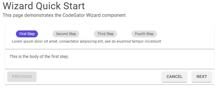
In the inner MudCard header, we check the value of the ShowChips property. If that value is true, we then loop through and create a MudChip for each wizard panel in the _panels variable. The _panels variable is maintained in the code-behind, which we’ll look at shortly. For now, just know that _panels contains a reference to the steps in the wizard. The result of those chips, in the header, looks something like this:
Below the chips, in the header, we check the SelectedPanel property to see if there is a currently selected wizard panel. If so, we show the description for that wizard step. Also, If we aren’t showing the chips (which already contain the title), then we also show the title for the currently selected wizard step.
The main content of the wizard is simply the @ChildContent render fragment. In order to only show the selected wizard panel, instead of all the panels at once, we defer to logic in the panels themselves. We’ll look at that, shortly. For now, just know that this is where we render the body of the wizard component.
The button area (or action area, in MudBlazor parlance), is at the bottom of the component. This is where we have the familiar previous, next, finish, cancel wizard buttons. Note that we don’t render the buttons until the SelectedIndex property contains a value. That’s a work around, on my part. I noticed, before I added that check, that the wizard would render the header and buttons first, then render the body of the current panel afterwards. I know why it happens, it has to do with way that I make the initial wizard selection. I’ll cover that when I cover the code-behind. But, for now, let’s just say it was annoying so I added the SelelectedIndex check to ensure the entire component renders at once.
The buttons are all contained within the MudCardActions tag. MudCardActions is another part of MudBlazor, and is how that library partitions the contents of a MudCard (recall that our wizard control is built using a MudCard), for layout purposes. The end result, of putting our buttons within the MudCardActions tag, is that our wizard buttons all live together, nicely, at the bottom of the wizard, where they should be.
The buttons are all contained within MudTooltip tags, which are also part of MudBlazor. Those tags ensure our wizard buttons show helpful popup tips, whenever a user hovers the mouse over them.
The buttons themselves are MudButton tags. They are each bound to different internal properties, and event handlers, on the MuddyWizard component. The end result is, these buttons navigate our wizard back and forth, as needed, by the user. Don’t worry, I’ll show how that’s done when I get to the code-behind – which brings us to …
The code behind, for MuddyWizard looks like this:
public partial class MuddyWizard : MudComponentBase, IAsyncDisposable
{
    private readonly IList<MuddyWizardPanel> _panels;
    private bool _disposed;

    [Parameter]
    public EventCallback<IndexChangedEventArgs> IndexChanged { get; set; }

    [Parameter]
    public EventCallback WizardFinished { get; set; }

    [Parameter]
    public EventCallback WizardCancelled { get; set; }

    public Variant ButtonVariant { get; set; }

    public Color CancelColor { get; set; }

    [Parameter]
    public RenderFragment ChildContent { get; set; }

    protected string Classname => new CssBuilder("mud-wizard")
        .AddClass(Class)
        .Build();

    public Color DescriptionColor { get; set; }

    public Typo DescriptionTypo { get; set; }

    [Parameter]
    public int Elevation { set; get; }

    public Color FinishColor { get; set; }

    public Color HeaderChipColor { get; set; }

    public Color HeaderChipSelectedColor { get; set; }

    public Variant HeaderChipVariant { get; set; }

    protected bool IsPreviousDisabled =>
        !SelectedIndex.HasValue || SelectedIndex <= 0;

    protected bool IsNextDisabled =>
        !SelectedIndex.HasValue || SelectedIndex >= _panels.Count - 1;

    protected bool IsFinishVisible =>
        ShowFinish && (!SelectedIndex.HasValue || SelectedIndex >= _panels.Count - 1);

    public Color NextColor { get; set; }

    public bool Outlined { get; set; }

    public Color PreviousColor { get; set; }

    public IReadOnlyList<MuddyWizardPanel> Panels =>  _panels.ToList();

    [Parameter]
    public int? SelectedIndex { get; set; }

    [Parameter]
    public MuddyWizardPanel SelectedPanel { get; set; }

    public bool ShowCancel { get; set; }

    public bool ShowChips { get; set; }

    public bool ShowFinish { get; set; }

    public bool Square { get; set; }

    public Color TitleColor { get; set; }

    public Typo TitleTypo { get; set; }

    public MuddyWizard()
    {
        _panels = new List<MuddyWizardPanel>();
        ButtonVariant = Variant.Filled;
        CancelColor = Color.Default;
        DescriptionColor = Color.Default;
        DescriptionTypo = Typo.caption;
        Elevation = 1;
        FinishColor = Color.Default;
        HeaderChipColor = Color.Default;
        HeaderChipSelectedColor = Color.Primary;
        HeaderChipVariant = Variant.Filled;
        NextColor = Color.Default;
        PreviousColor = Color.Default;
        ShowCancel = true;
        ShowChips = false;
        ShowFinish = true;
        TitleColor = Color.Default;
        TitleTypo = Typo.h4;
    }

    public void Select(
        MuddyWizardPanel panel
        )
    {
        // Get the index for the panel.
        var index = _panels.IndexOf(panel);

        // Did we find the panel?
        if (-1 != index)
        {
            // Make the selection.
            Select(index);
        }
    }

    public void Select(
        int? index
        )
    {
        // Sanity check the index first.
        if (index == SelectedIndex)
        {
            return; // Nothing to do.
        }

        // Create arguments for the event.
        var eventArgs = new IndexChangedEventArgs()
        {
            NewIndex = index,
            CurrentIndex = SelectedIndex
        };

        // Fire the event.
        IndexChanged.InvokeAsync(eventArgs);

        // Should we cancel the navigation?
        if (eventArgs.NewIndex == eventArgs.CurrentIndex)
        {
            return;
        }

        // Is the index within a valid range?
        if (eventArgs.NewIndex >= 0 &&
            eventArgs.NewIndex < _panels.Count)
        {
            // Update the index.
            SelectedIndex = eventArgs.NewIndex;

            // Select the current panel.
            if (eventArgs.NewIndex.HasValue)
            {
                SelectedPanel = _panels[eventArgs.NewIndex.Value];
            }
            else
            {
                SelectedPanel = null;
            }
        }

        // Ensure the UI is updated.
        StateHasChanged();
    }

    protected internal void AddPanel(
        MuddyWizardPanel panel
        )
    {
        // Add the panel to the collection.
        _panels.Add(panel);
    }

    protected internal Task RemovePanel(
        MuddyWizardPanel panel
        )
    {
        // Remove the panel from the collection.
        _panels.Remove(panel);

        // Return the task.
        return Task.CompletedTask;
    }

    protected void OnNext()
    {
        // Select the next panel.
        Select(SelectedIndex + 1);
    }

    protected void OnPrevious()
    {
        // Select the previous panel.
        Select(SelectedIndex - 1);
    }

    protected async Task OnCancel()
    {
        // Raise the event.
        await WizardCancelled.InvokeAsync();
    }

    protected async Task OnFinish()
    {
        // Raise the event.
        await WizardFinished.InvokeAsync();
    }

    protected void OnHeaderSelect(MudChip chip)
    {
        // Do we have a selection?
        if (null != chip)
        {
            // Look for the corresponding panel.
            var panel = _panels.FirstOrDefault(x => x.Title == chip.Text);

            // Did we find one?
            if (null != panel)
            {
                // Update the selection.
                Select(panel);
            }
        }
    }

    protected override void OnAfterRender(bool firstRender)
    {
        if (firstRender)
        {
            // Try to select the first page.
            Select(0);
        }
    }

    public async ValueTask DisposeAsync()
    {
        // Have we already been disposed?
        if (_disposed == true)
        {
            return; // Nothing to do.
        }

        // Mark that we've been disposed.
        _disposed = true;

        // TOOD : write the code for this.
    }
}
The MuddyWizard component derives from the MudComponentBase class, which is what integrates us nicely with the MudBlazor library.
Looking at the fields, we see the _panels collection. This is where we’ll keep references to any MuddWizardPanel objects that are added to the wizard. MuddWizardPanel is the component I use to represent a wizard step. I’ll cover that type shortly.
There are two overloads named Select in the code-behind, that select the current step in the wizard. Once accepts a MuddyWizardPanel instance, the other accepts an index. Let’s look at how the latter works. The first thing we do is determine whether a valid index was passed in, as the argument. If so, we create an IndexChangedEventArgs instance and raise the IndexChanged event. After that we check the value of the NewIndex property, on the IndexChangedEventArgs object. That value can be changed to modify the default navigation, for the wizard. Using that value, we then check to see if a new panel needs to be selected. If so, we perform some simple math to ensure the index will be valid, then we modify the SelectedPanel property with a reference to the newly selected panel. Finally, we update the Blazor UI by calling StateHasChanged.
The AddPanel method adds a new MuddyWizardPanel instance to the _panels collection.
The RemovePanel method removes an existing MuddyWizardPanel instance from the _panels collection.
The OnNext method is bound to the Next button and is called when the user clicks the button. The handler calls the Select method with the index to the next wizard step.
The OnPrevious method is bound to the Previous button and is called when the user clicks the button. The handler calls the Select method with the index to the previous wizard step.
The OnCancel method is bound to the Cancel button and is called when the user clicks the button. The handler raises the WizardCancelled event.
The OnFinish method is bound to the Finish button and is called when the user clicks the button. The handler raises the WizardFinished event.
The OnHeaderSelect method is bound to the chips in the wizard header and is called whenever one of those chips is clicked, by the user. The handler calls the Select method with the index to the appropriate wizard step.
The OnAfterRender method is overridden in order to select the first wizard step. By default, the first step in the wizard is always index zero. I might create a property, at some point, to allow a non-zero startup index.
The DisposeAsync method is called when the MuddyWizard component is garbage collected, by the .NET runtime. Right now I’m not doing anything with this method, but, I have it here because I intend to do something with it, down the road.
The other part of the wizard component are the panels themselves. These components are considered child content to the MuddyWizard. Each one may contain any valid Blazor and/or HTML content. The wizard flips through these panels and shows one at a time, for the current wizard step.
Here is the markup for the MuddyWizardPanel component:
@namespace CG.Blazor.Wizard
@inherits MudComponentBase
@implements IAsyncDisposable

@if (Parent.SelectedPanel == this)
{
    @ChildContent
}
Not much here, really. The main purpose of the panel is to wrap the child content, so, there really isn’t much here to discuss.
One thing that is interesting though is how we check to see if we’re the currently selected wizard panel, and if so, render the child content for the panel. This is the mechanism that flips between wizard panels, at runtime, as they are changed by the user.
Here is the code-behind for the MuddyWizardPanel component:
public partial class MuddyWizardPanel : MudComponentBase, IAsyncDisposable
{
    private bool _disposed;

    [CascadingParameter]
    protected internal MuddyWizard Parent { get; set; }

    [Parameter]
    public RenderFragment ChildContent { get; set; }

    [Parameter]
    public string Title { get; set; }

    [Parameter]
    public string Description { get; set; }

    protected override void OnInitialized()
    {
        // Add ourselves to the parent wizard.
        Parent.AddPanel(this);

        // Give the base class a chance.
        base.OnInitialized();
    }

    public async ValueTask DisposeAsync()
    {
        // Have we already been disposed?
        if (_disposed == true)
        {
            return; // Nothing to do.
        }

        // Mark that we've been disposed.
        _disposed = true;

        // Cleanup our reference in the parent wizard.
        await Parent?.RemovePanel(this);
    }
}
The MuddyWizardPanel derives from MudComponentBase, so we can integrated it nicely with the MudBlazor library.
The class has a property named Parent, that contains a reference to the parent wizard component.
There is also a property named Title that contains an optional title for this wizard step.
Finally, there is also a property named Description, that contains an optional description for this wizard step.
The OnInitialized method is where we add ourselves to the parent wizard component.
The DisposeAsync method is where we remove ourselves from the parent wizard component.
I covered how to use the wizard component in my last blog entry. Look back there for a refresher.
In the future I hope to improve the wizard header. Right now I’m using individual chips for the wizard steps but I don’t like the way that looks. Also, if there are too many steps I think the header chips should scroll, like the MudTabs component does. Anyway, all something to work on, I guess.
Thanks for reading. I hope you get some good use out of my little wizard component.
Photo by Matt Briney on Unsplash